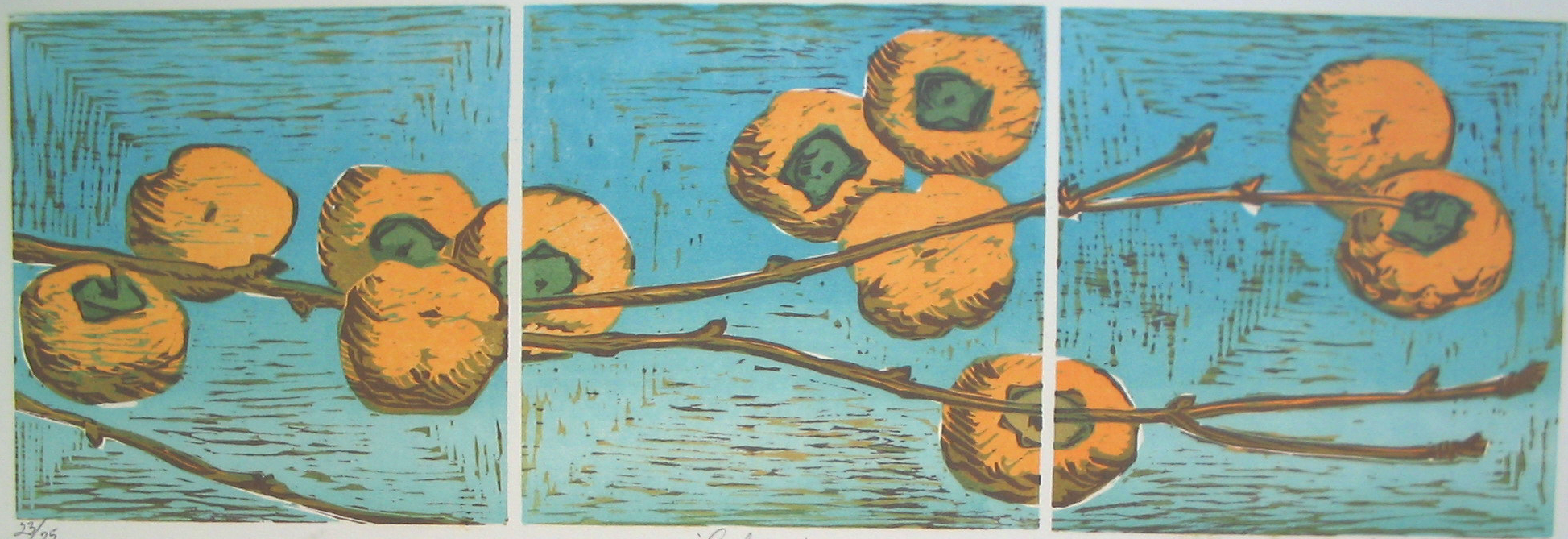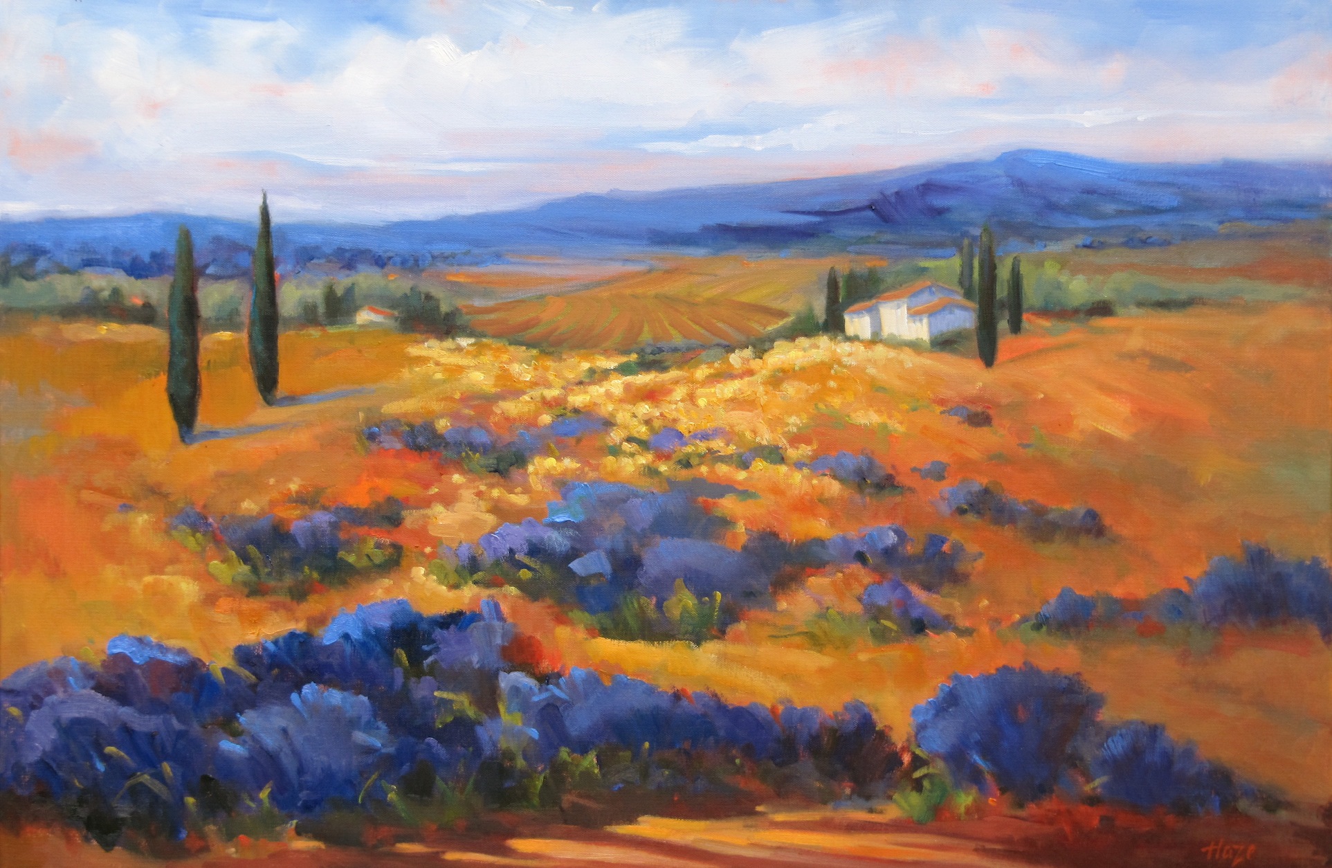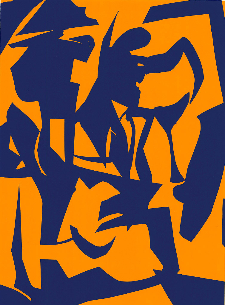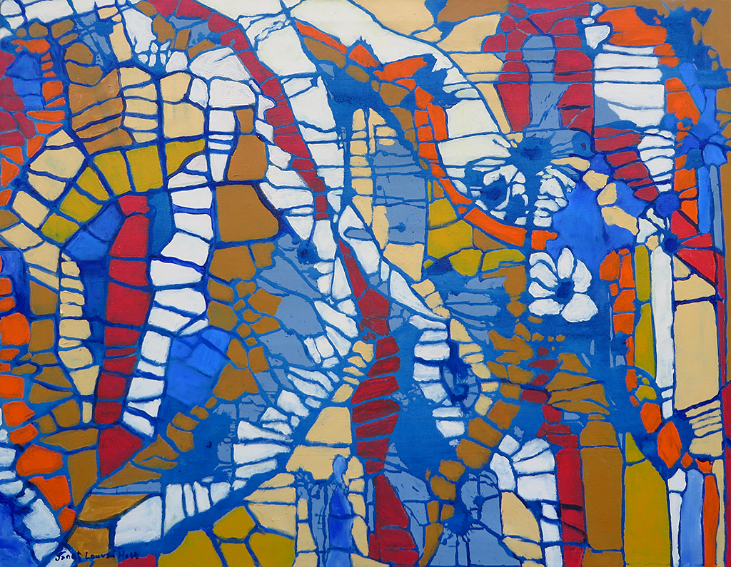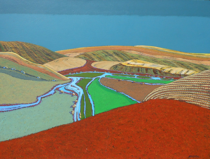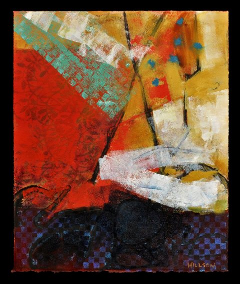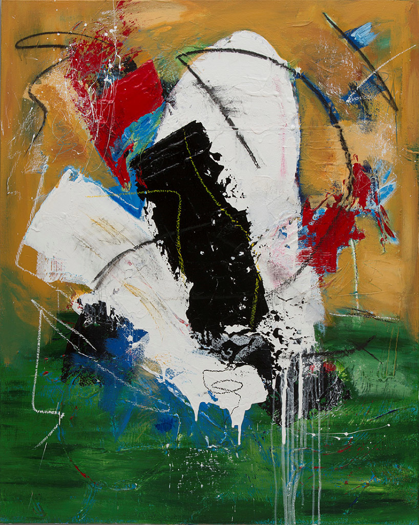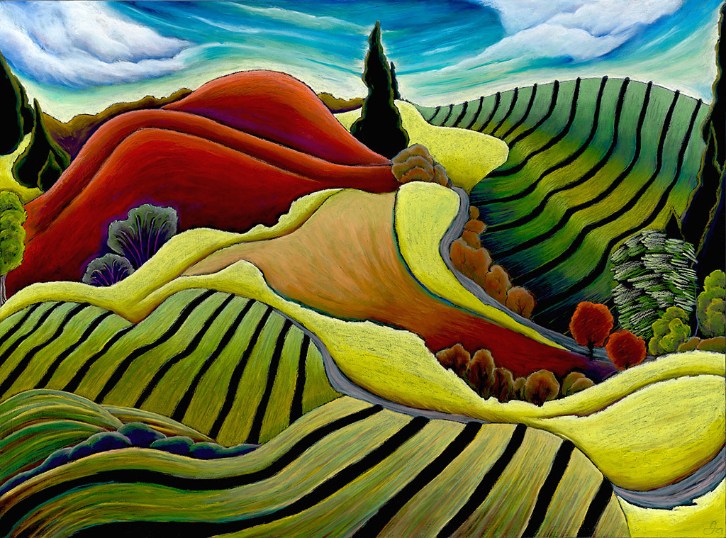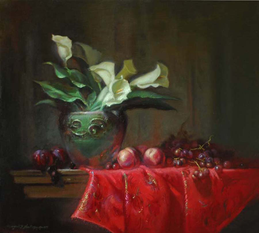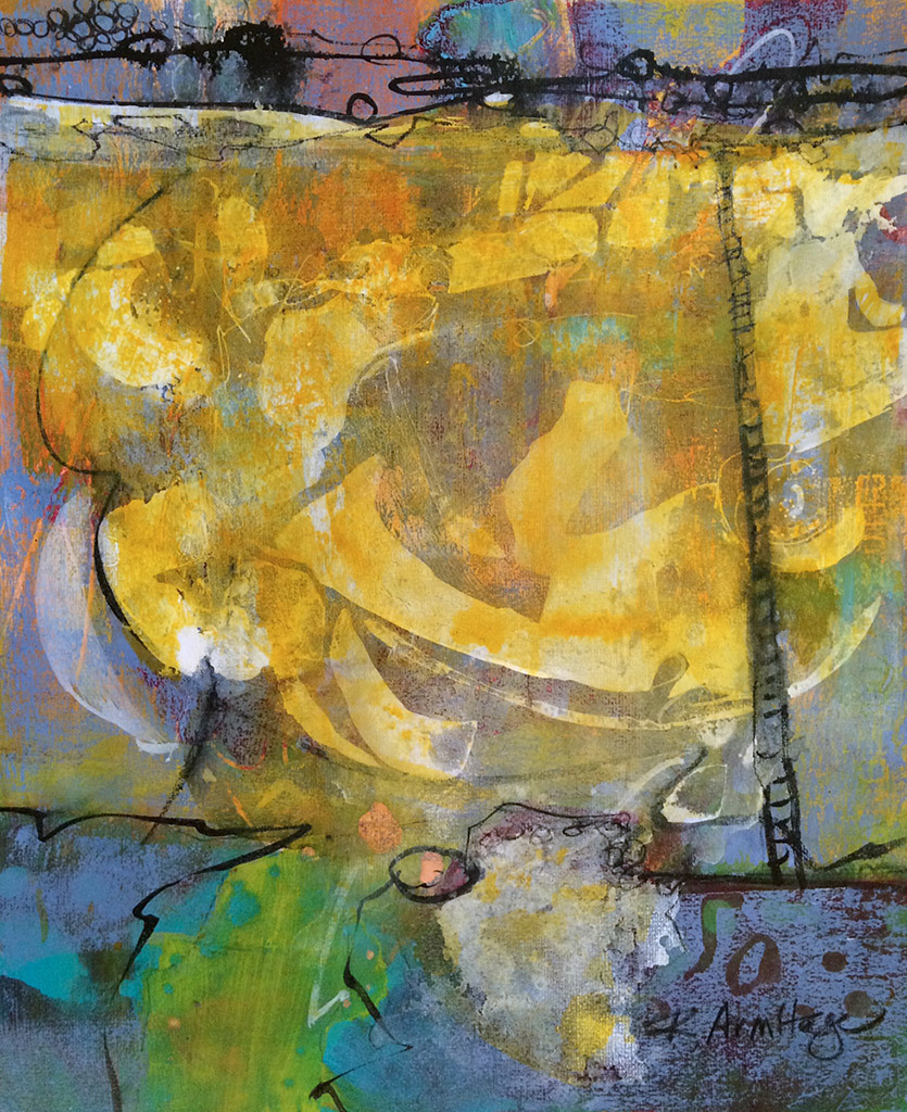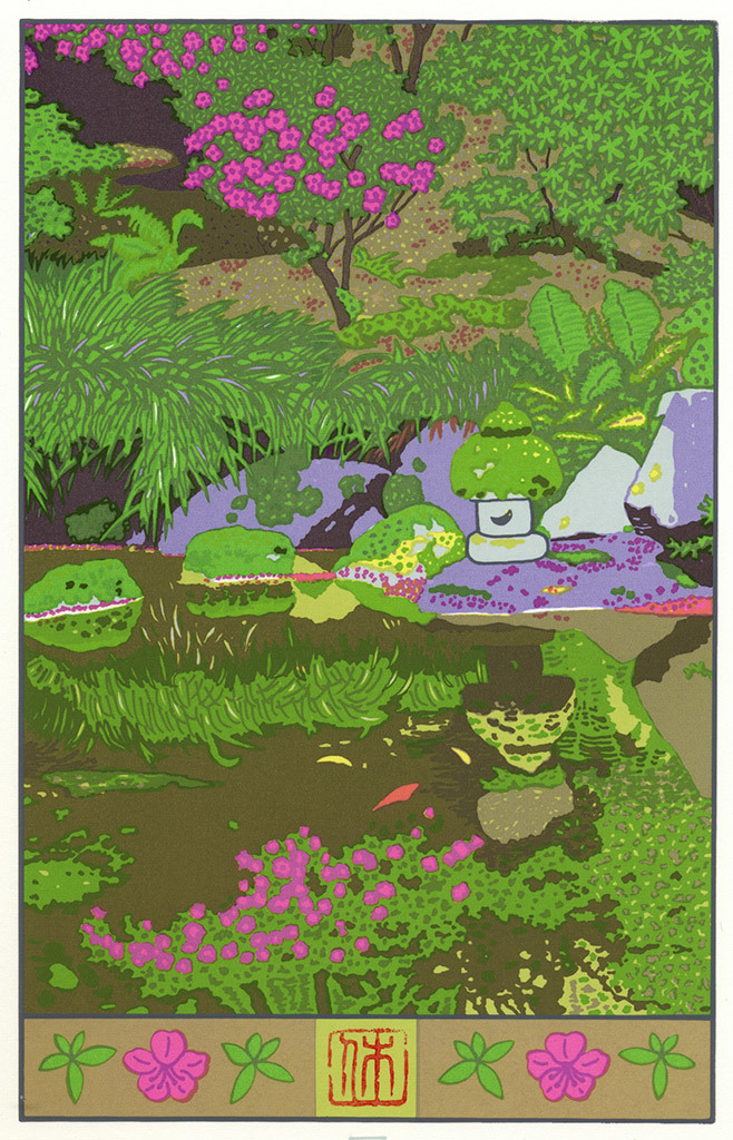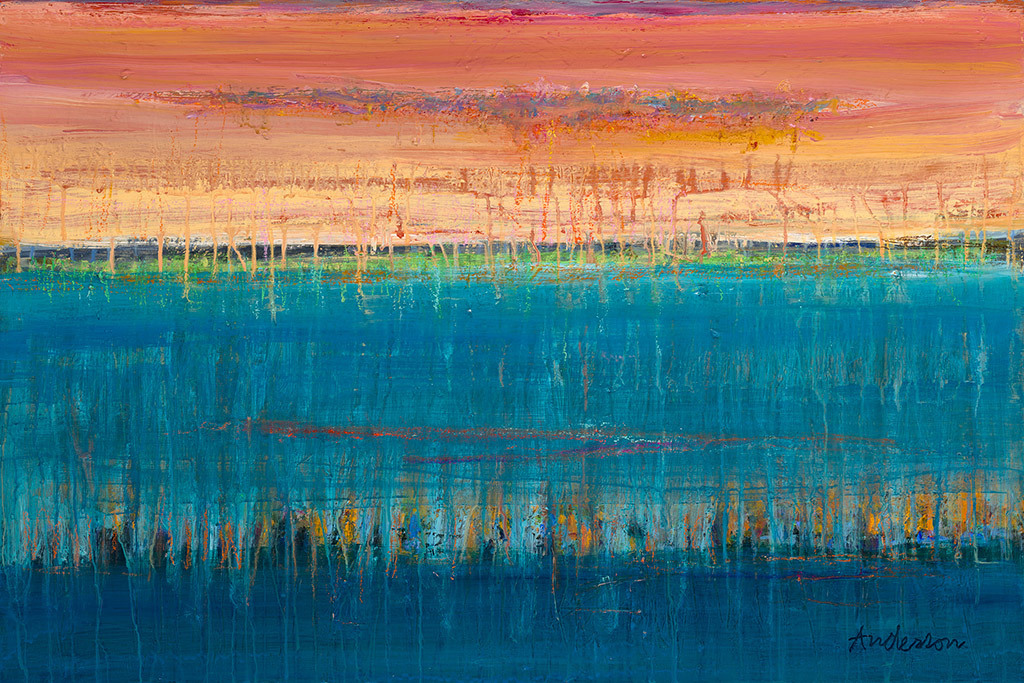
Artists have a lot of tricks up their sleeves. They know how to fool the eye into believing all sorts of things that aren’t true. A flat piece of canvas can appear to have depth, or glow, with the flick of a brush. One such trick is the use of complimentary colors. Pairing colors that are on opposite ends of the spectrum make them pop, and appear more intense than when they’re on their own. Don’t believe me? As you scroll through these images, try covering one of the colors and see what happens to its counterpart. Pretty neat, eh?