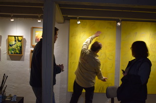
For the 2nd stop on our Vancouver artists tour, we were invited to visit Tom Relth’s studio in the basement of his home. The home was a charming little bungalow in a light industrial area on the cusp of downtown Vancouver. As Tom and his wife, Leslie, greeted us they explained that the house was built around 1901. We filed down into the basement where Tom shared his plans to continue renovation and expansion of his partially finished studio. The space had a nice gallery environment with painted open beamed ceilings and his artwork adorning the walls. We gathered around a large work table as Tom continued his story with a bit of travel history. At various times in his life he had been a high school teacher, a representative for high end printing presses, and more recently a teacher in Morocco for some five years.
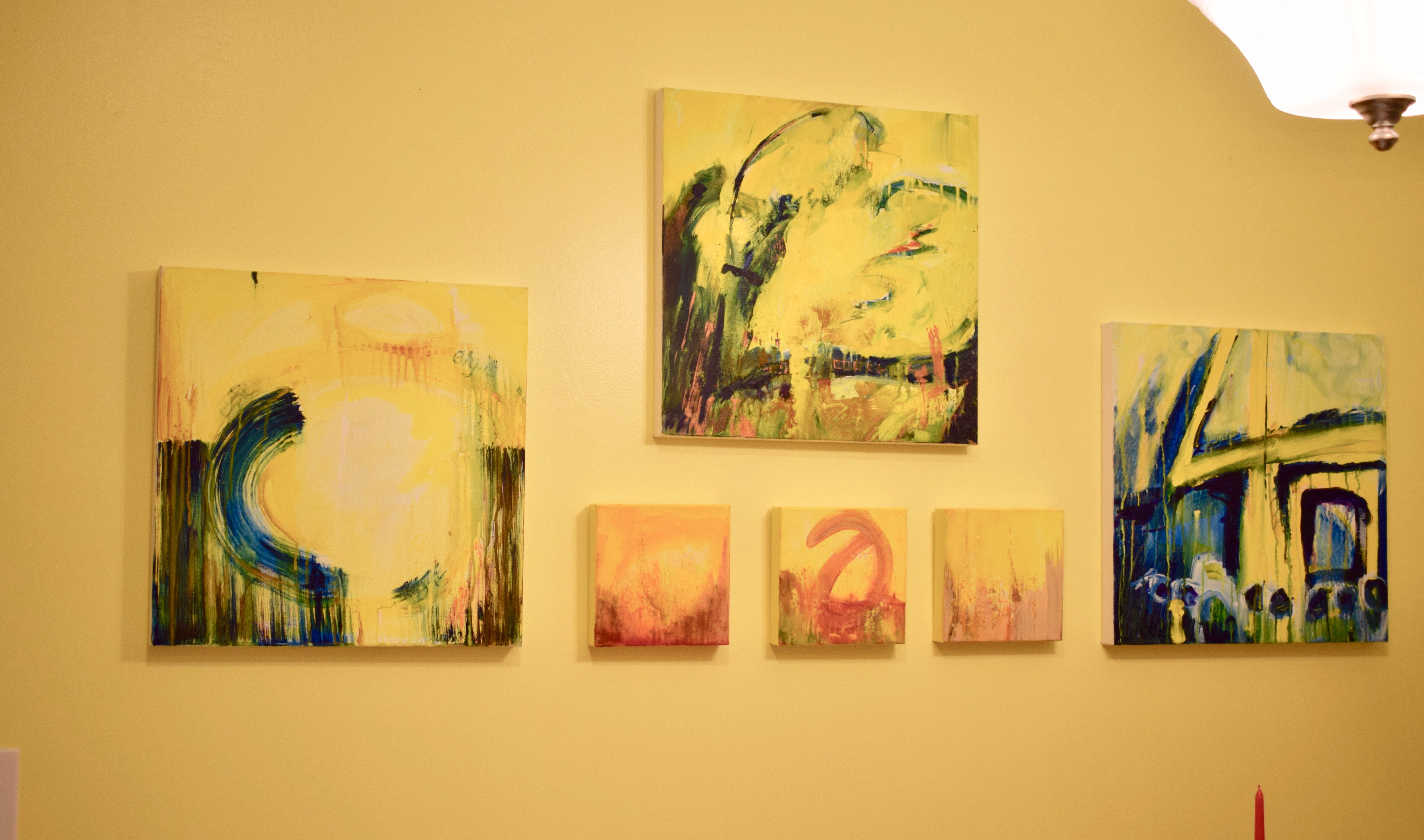
It was in Morocco where Tom was inspired to create his most recent body of work. The dominant theme color is warm shades of yellow, much like the spices you might find in that part of the world. Tom added that his use of the bright color is like painting sunshine, a reminder of man’s presence under the sun. That, and “yellow has rhythm”. He then covers his canvases with mark making, numbers, calligraphy, or what he terms as “automatic writing”. For him, these markings, using the golden ratio, simply break up space. Furthermore, his use of words, symbols, and numbers comes from a Muslim concept of “not representing that which God has made.” He pointed to one piece on the wall explaining that he used this concept combined with the sacred number 33, the age many believe Jesus was at the time of his death, from the chapel in Gaudi’s Church Le Sagrada Familia in Barcelona. Tom chose the number 5 as inspiration for his combination of number markings.
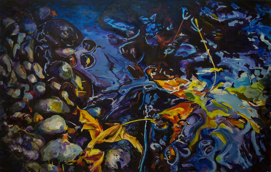
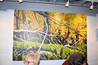
Looking around the room, older works showed more representational views of nature. Blues and greens dominated in treescapes and swirling water scenes. Pointing, Tom explained these were in response to Annie Dillard’s “Pilgrim on Tinkers Creek”, where she spoke of nature’s complexity and how often artists idealize it, creating a very stylized result. 
Tom is currently creating new works using the digital printer colors of magenta, cyan, and yellow. He uses these as a start and then adds complimentary colors, often times making his own paints. Ground spices and herbs can be found on his canvases with the aid of a product called Proceed, made by Golden. Proceed can be used as a glazing medium to tone colors down or darken hues. His choice of Golden paints is the closest he can get to his favorite French brand called Pebeo.
When a painting is nearly finished, Tom feels it is completed when it no longer irritates him. He steps back and asks “what irritates me?” (borrowing from architect Frank Gehry). Expanding further, he gets a feeling of connection and peace, like standing along the coast at sunset. When that blissful feeling replaces irritation, the painting is done.
Moving up to the first floor of their cozy home, we could see his colorful paintings filled every room. All those bright yellows popped in contrast on the soft grey walls of the living space and strong saturated blues in some works hung on yellow walls in the kitchen. To complete their unique style, the living room featured a Morrocan style seating arrangement with sections of couch arranged in a square for maximum engagement. 
We were treated to quite a feast of tapas including Spanish goat cheese, antipasta and olives, hummus, veggies, rolls, and pita bread with tapenade; all very Mediterranean. We spread out enjoying conversation, sipping wine, perusing through more images of Tom’s work on his Mac, and listening to stories. Again, we chose a couple works to bring back with us from the studio and they are currently hanging in the gallery. Come see!
To see works by Tom Relth, please click here.